Logo — versions
Wordmark · size lockups

The Aquiva brand and design system: colour, type, components, and usage. Generated from the design system, always current.
Aquiva is the AI-native consulting and engineering partner for growth companies. This book is the whole brand in one place: logo, color, type, voice, and the components we build products with, each paired with how and when to use it.
The look is cool, calm, professional: cornflower blue and jackson purple with a cerise-red accent, geometric Lexend headlines over humanist Open Sans body. Everything here is generated from the live design system, so it never drifts from what ships.
Aquiva has two logo lockups. The wordmark is the primary logo, the full AQUIVA name. Reach for it by default, wherever there's room for the name to read.
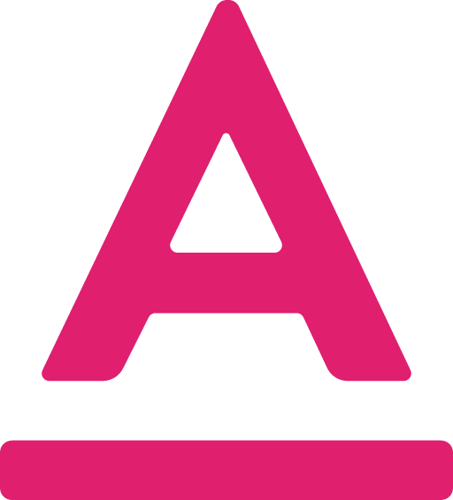
The A-sign is its compact square form, the "A" mark on its own, for tight spots the wordmark can't fill: avatars, app icons, favicons, a badge in a UI corner. Use it only when the full name can't.
Within either lockup, pick the color version that suits the background (indigo on light, white on dark, monochrome for one-color work). Keep clear space of at least the mark's height on every side, and don't take the wordmark below 12px tall.
The mark is fixed. These are the rules that keep it that way: what to do, and what never to.
Do
Don't
Blue leads, purple supports, and pink accents used sparingly. Hold the ratio below and the palette stays unmistakably Aquiva. Pink is for emphasis only, never a background.
--aq-blue--aq-blue-alt--aq-blue-bright--aq-blue-deep--aq-blue-light--aq-blue-bg-soft--aq-blue-pale--aq-blue-dusk--aq-purple--aq-purple-2--aq-purple-warm--aq-purple-deep--aq-purple-ink--aq-purple-midnight--aq-violet-light--aq-violet-pale--aq-pink--aq-pink-light--aq-ink--aq-gray--aq-gray-mid--aq-bg--aq-bg-alt--aq-white--aq-black--aq-grad-brand--aq-grad-warm--aq-grad-full--aq-grad-soft-bg--aq-grad-deep--aq-glow-pink--aq-glow-blue--aq-glow-purple--aq-glow-soft--aq-photo-overlay--fg-1--fg-2--fg-3--fg-accent--fg-accent-strong--fg-accent-warm--fg-on-brand--bg-app--bg-surface--bg-soft-blue--bg-soft-violet--bg-brand--bg-brand-strong--border-subtle--border-strong--surface-dark-1--surface-dark-2--surface-dark-mid--on-dark-1--on-dark-2--on-dark-3--border-dark--border-dark-strong--surface-code--surface-code-2--code-ok--code-warn--code-action--code-info--code-border--code-border-accent--code-warn-soft--term-ctl-close--term-ctl-min--term-ctl-maxBlue leads every composition. Purple supports without overtaking. Pink sparks — icons, quote marks, a single highlighted word — but never a background.
Two families do the work: geometric Lexend for display and headings, humanist Open Sans for body. JetBrains Mono handles code and terminals. Emphasis inside a headline is set in cerise pink: one accented phrase at most, never italics.
Lead. Open Sans 18/28. By the end of week one, you're usually clicking through a working prototype.
Body. Open Sans Regular 16/26. Growth companies bring us problems that rarely line up with a vendor's product taxonomy.
Caption · Open Sans 13 / Light Gray
Use <em> inside any heading — the brand stylesheet renders it pink, weight 500, never italic. One accented phrase per headline.
Voice is what we say; tone is how we say it. We write in the first person plural, plain and concrete: specifics a reader can picture over abstractions they have to decode. Every sentence has to survive the question "what do we mean?", and when the honest answer is simpler than the sentence, the simpler version wins. Proof is named: real customers and real numbers, or nothing. And where a contrast tempts us to write "X, not Y," we name what X is made of instead.
Concrete
Name the specifics (components, tests, outcomes) rather than abstractions.
First person plural
We build, we ship, we own it with you.
Plain language
Every sentence survives the question "what do we mean?" The simpler honest version wins.
"We build durable solutions and products: components you can reuse, tests that catch regressions, and code your team can own after we leave."
"We leverage synergies to drive transformative value."
"We build software inside your org with your data model, permissions, and audit trail."
"We ship in days, not sprints."
One line-icon set, drawn at a consistent stroke weight. Color icons from the palette, and keep pink to a few at most, never the majority.
Icons


Where a print brand book stops, ours keeps going into product. These are the live components and applied examples built from the same tokens: buttons, badges, cards, inputs, and full sample pages and decks.
We operate as a true partner, bringing curiosity and commitment to every engagement.
We love what we do and embrace an explorer's mindset as we master our craft.
We do what we say — trust through transparency, dialog, and integrity.
Take what you need. Every asset in this book is downloadable on its own: logos, fonts, color tokens, and icons. Or grab the whole brand kit in one click.